National Concrete Coatings -
In Tandem With - SHARPE CREATIVE.
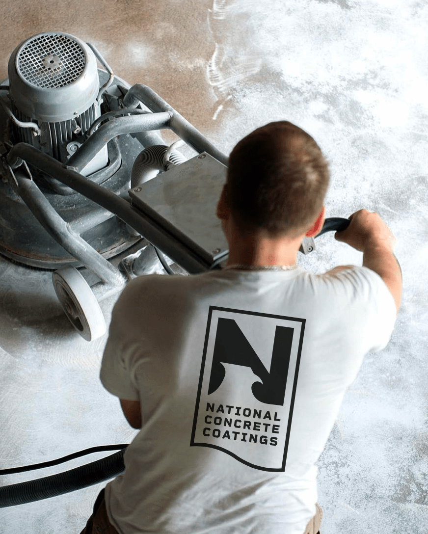
The project goal for National Concrete coatings was to deliver them branding that would scale with them as they grow. One very notable thing they mentioned to us was they wanted to scale nationally so, we needed to create an identity that would stand for what they believe and back up their hard work for generations to come.
Concept 1 - Chiseled
• Eagle is a symbol of pride/strength and a National bird
• National pride, pride in home, pride in trusted services
• Strong, reliable, and qualified
• Unique, ownable, simple, and flexible to use
• Hard, strong, tough, concrete-like edges
I took the traditional chunky type found on old blue-collar logos from back in the day and pared it with a modern mark to round the corner of simplicity/premium yet a call back to the hard-working man, the merging of these two is also embarking on the phrase "Durable and capable"
Concept 2 - The Punchy Badge
• Approachable and friendly
• High quality
• Seal/stamp of approval – standing by/endorsing your work
• Hard, strong, tough, concrete-like edges
• Versatile – elements can be deconstructed
The inspiration I pulled for this concept was a stamp of approval. Investing in the home can be quite expensive but with these logo concepts, we want to take the stress out of it by bringing you an approachable and bright Identity!
Approved Client Direction
Here’s my take on the chosen direction.
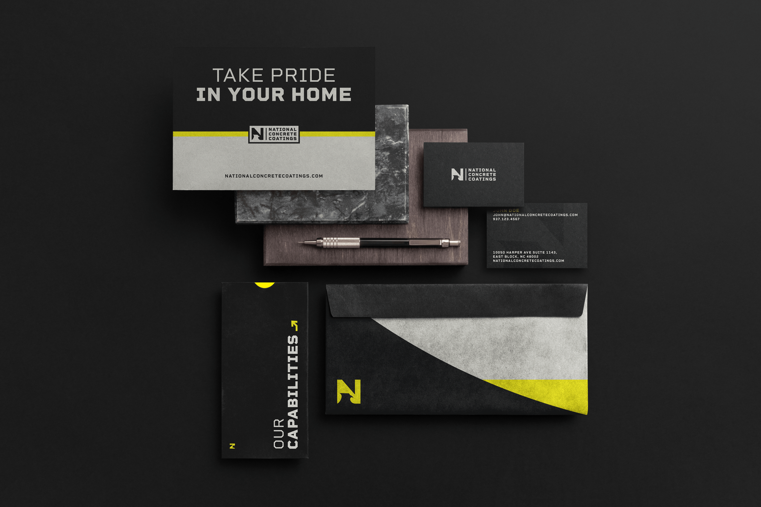
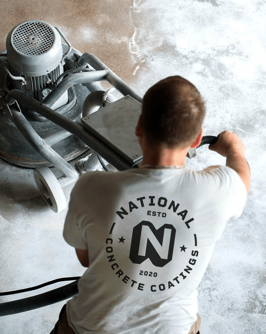
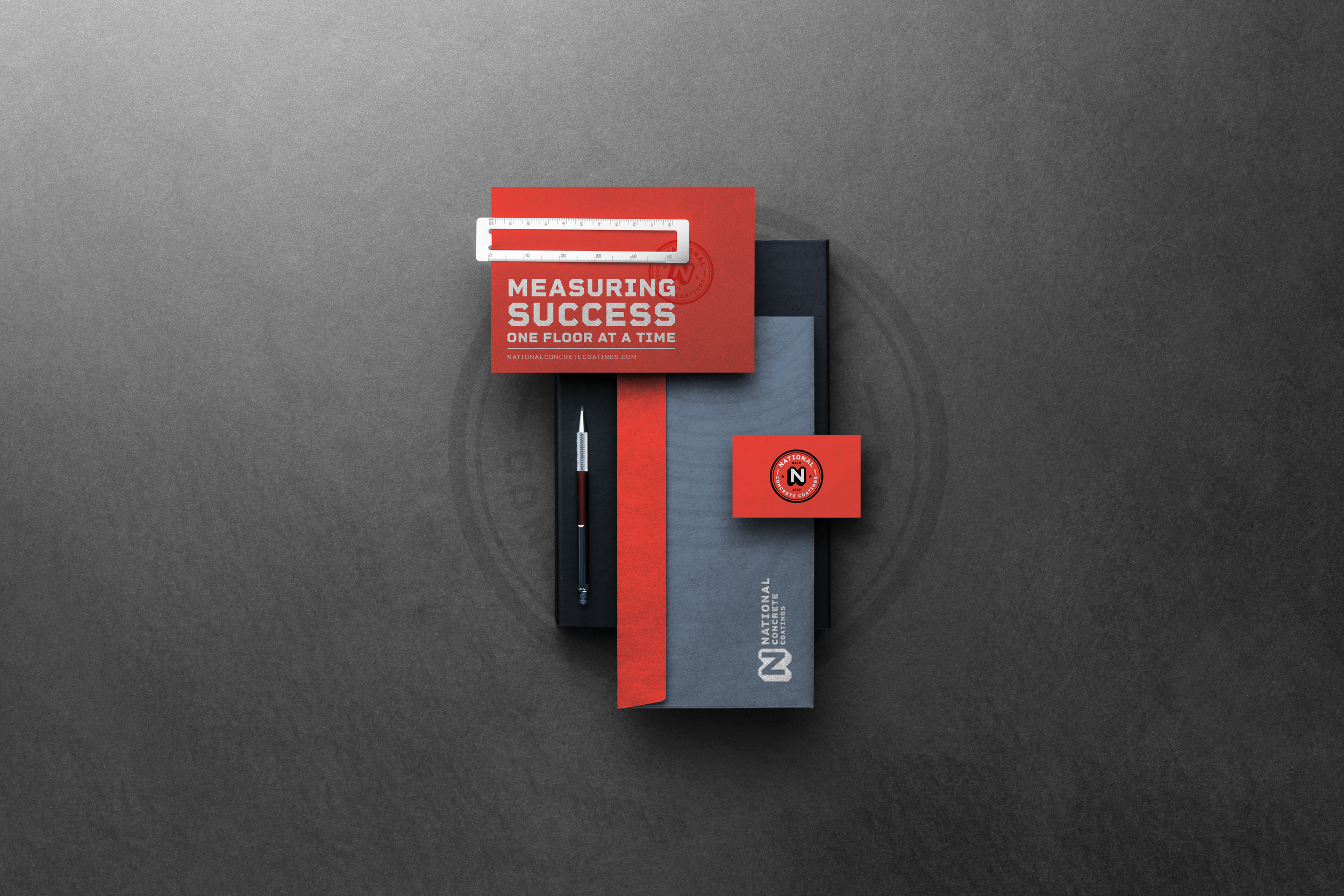
Andy Sharpe and I both took our own approach to explore and develop stylescapes based on the approved logo direction. The stylescapes are created in a collage-like way to represent all visual assets. These assets include the logo, typography, photography, color usage, website elements, and overall style.

